Interior Design: Tiffany Skilling Interiors | Architectural Design and Construction: William Gordon Group | Photography: Ashlee Kindred, Ash & Co. Creative
When a family decided to purchase and renovate a historic home in Midtown Indianapolis, one of the main areas they wanted to focus on was the kitchen. The choice of designer seemed obvious: Tiffany Skilling had been specializing in historical remodeling and modernizing for quite some time—including on her own home.
First point of business? The four-bedroom, six-bath home, while spacious, needed a much larger area for the kitchen. Skilling blew out the side of the home, creating a 19-foot, two-story addition that melds seamlessly with the landscape. The new addition on the main floor became the ultra-chic kitchen seen today, and the old kitchen and breakfast nook became part of the family room.
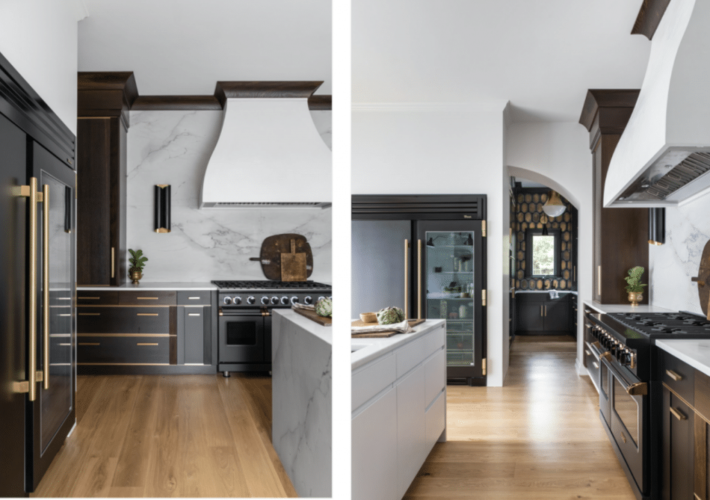
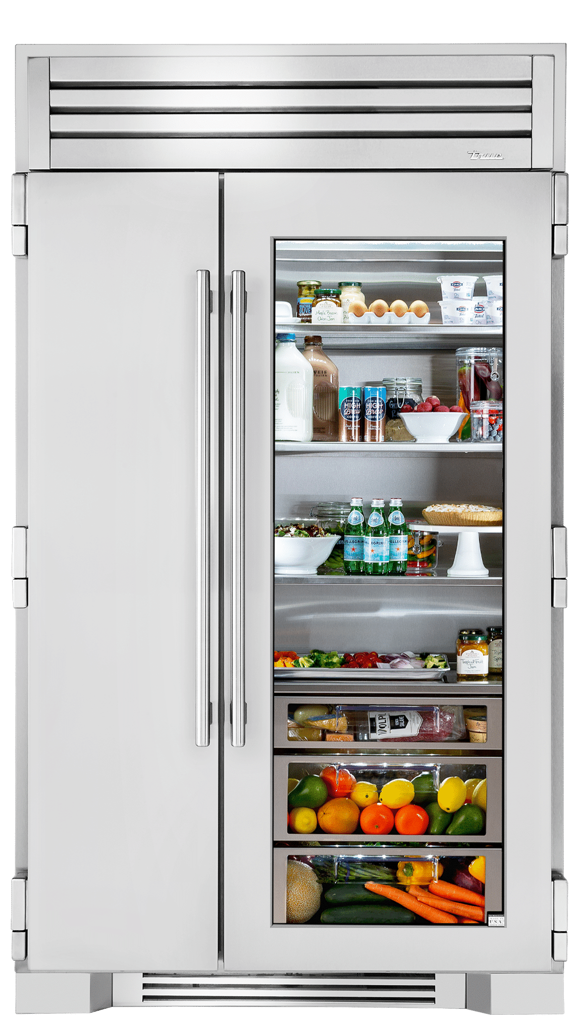
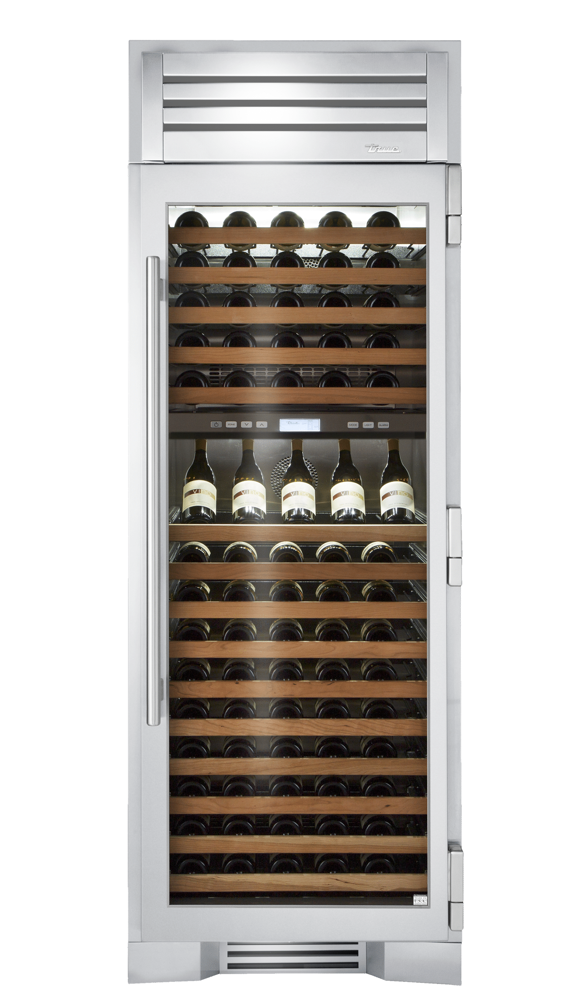
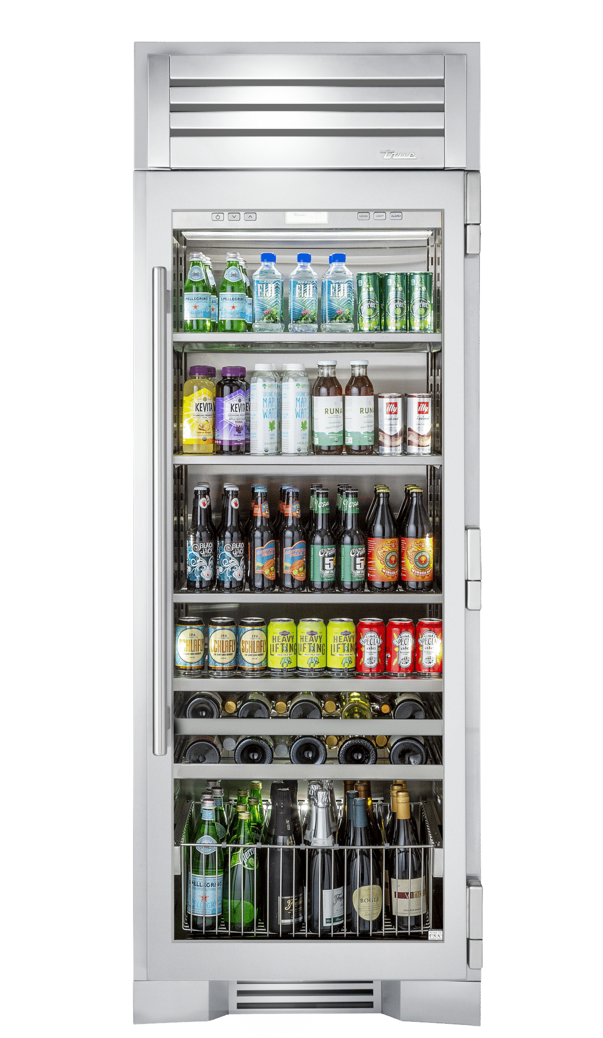
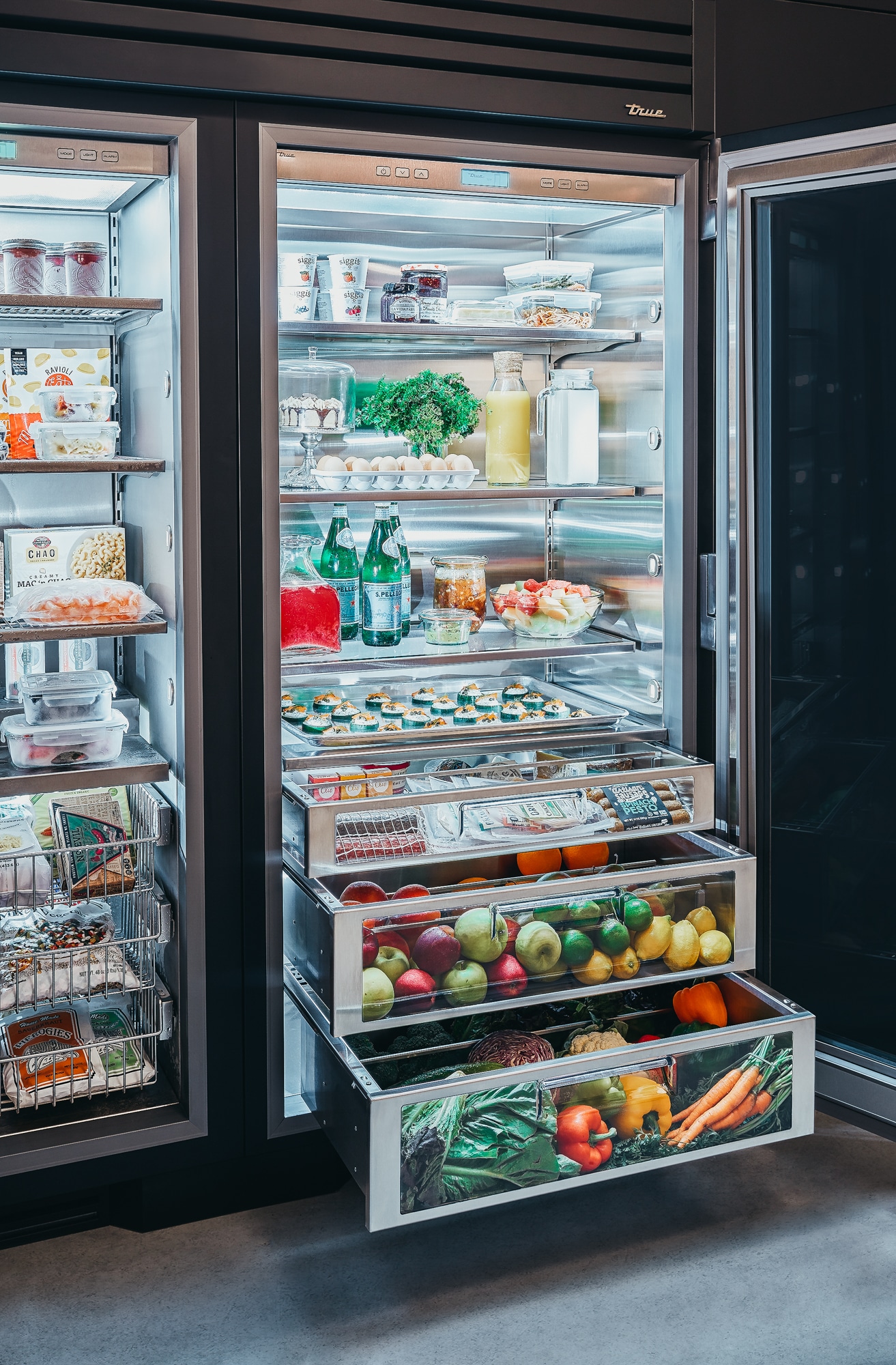
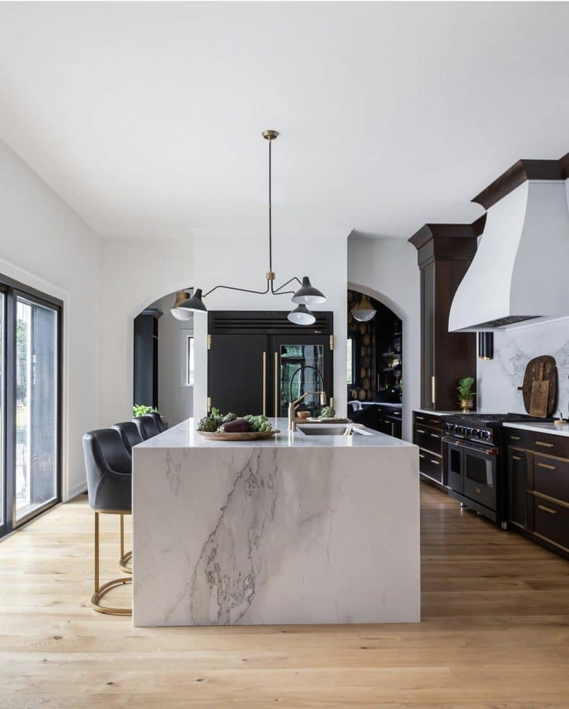
To cater to the client’s love of clean and modern design, Skilling went on a shopping spree with her at the local Ferguson’s to narrow down some appliance options. “Every time we passed the refrigerators, she absolutely loved the industrial elements of the True Residential units,” says Skilling. At one point, she even just said “I have to have it.” And so, two True Residential Units, one 30” Freezer Column and one 30” Refrigerator Column are joined together with one of our True Residential Joining Kits to form the perfect, cohesive 60” setup. While Skilling said the client was initially nervous about the glass door, she now loves it. Framing the refrigeration set up are two half arches on either side that pay homage to the architecture of the house. “She really wanted to make sure the architectural integrity of the historic home was thought about and respected,” says Skilling.
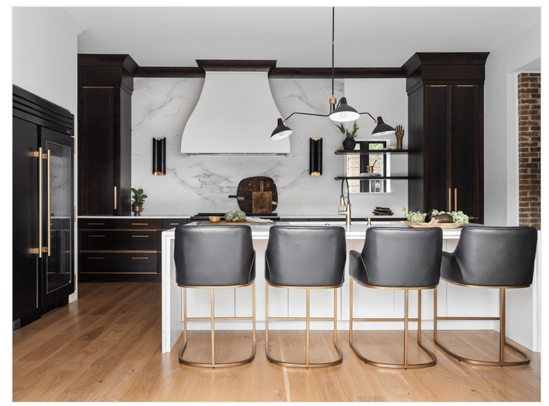
To modernize the space, the designer and client agreed on the units in our striking matte black finish, pairing them with gold hardware. Skilling painted the surrounding walls and custom hood in a stunning Venetian plaster that helped highlight the units. Warm floors and cabinets in a fumed oak style, collaborated on with Conceptual Kitchens & Millwork, add an additional touch of clean-lined modernism. A contemporary Brizo faucet, soft black leather bar stools from Restoration Hardware, and a gorgeous stone countertop fabricated by Olympia Stone completes the look.
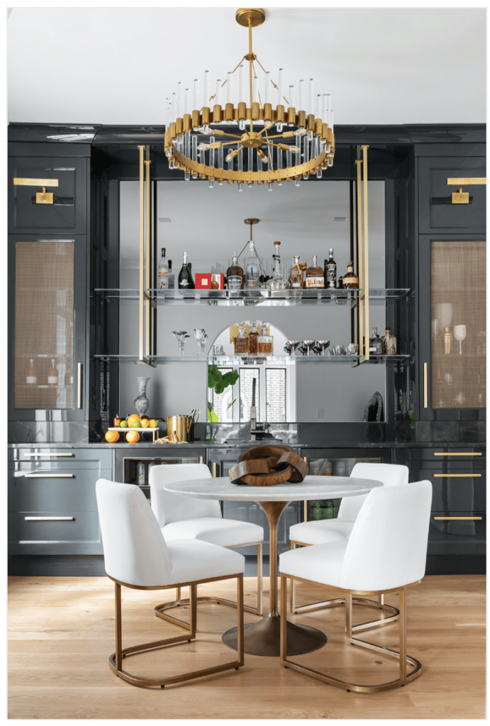
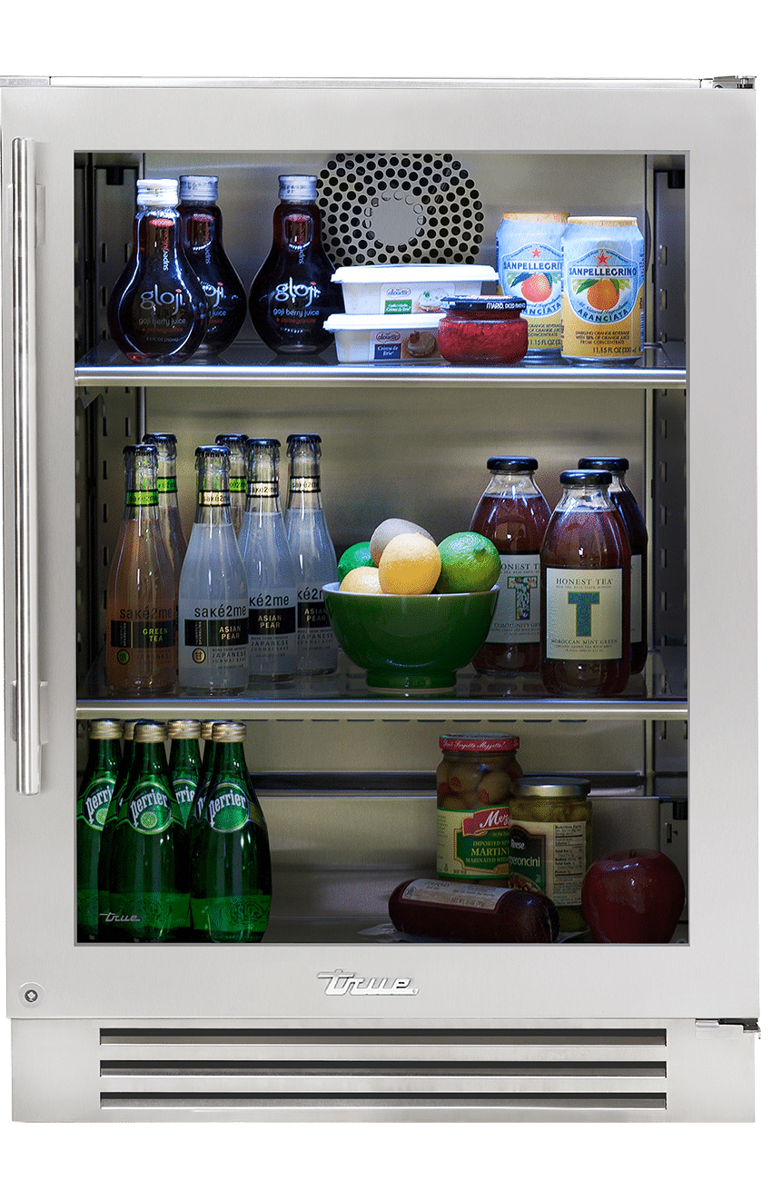
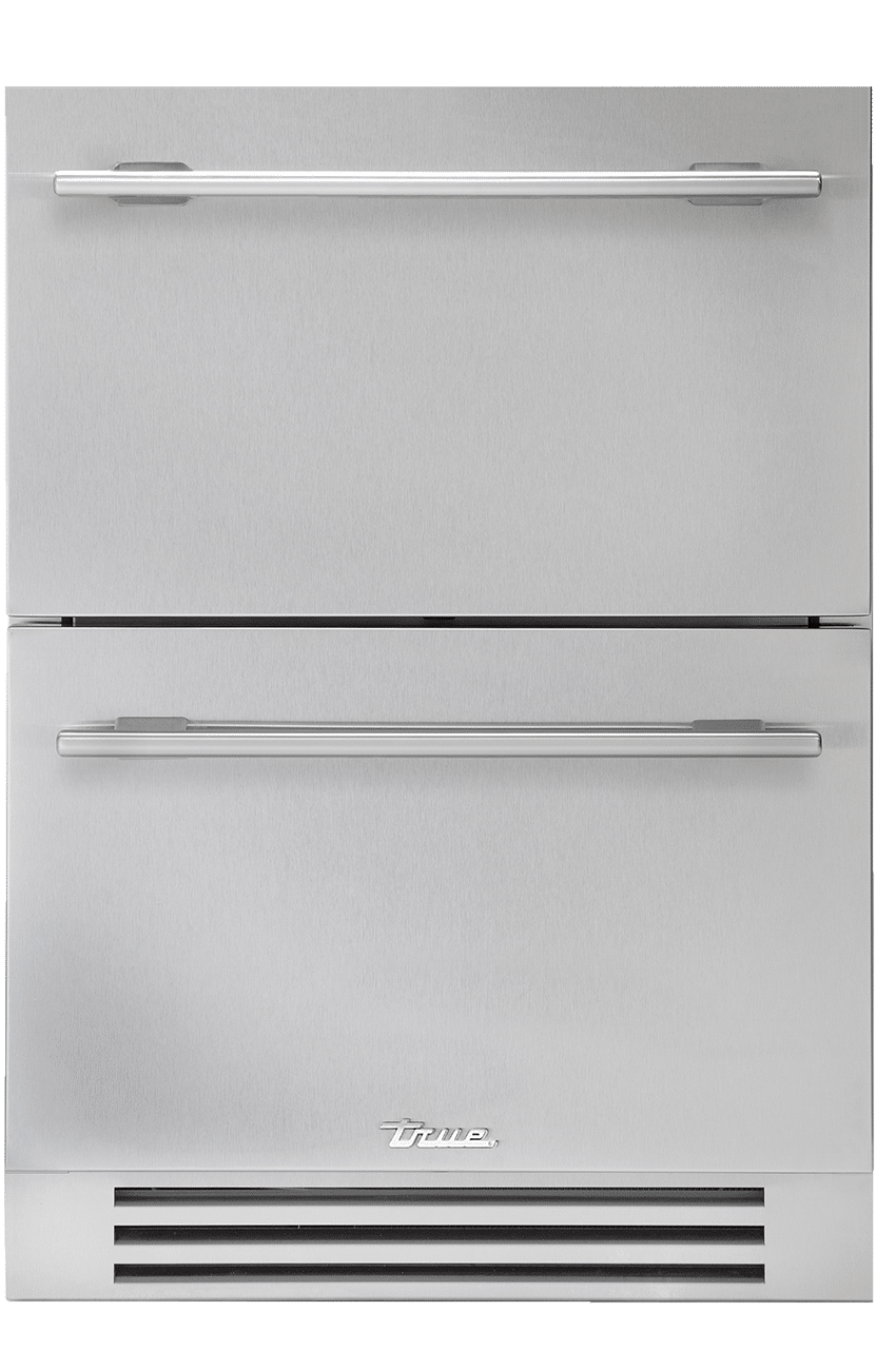
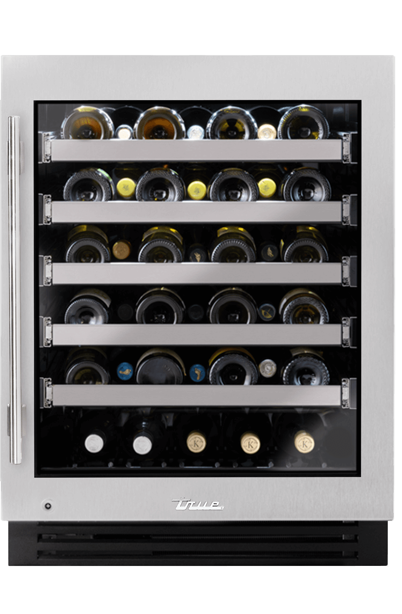
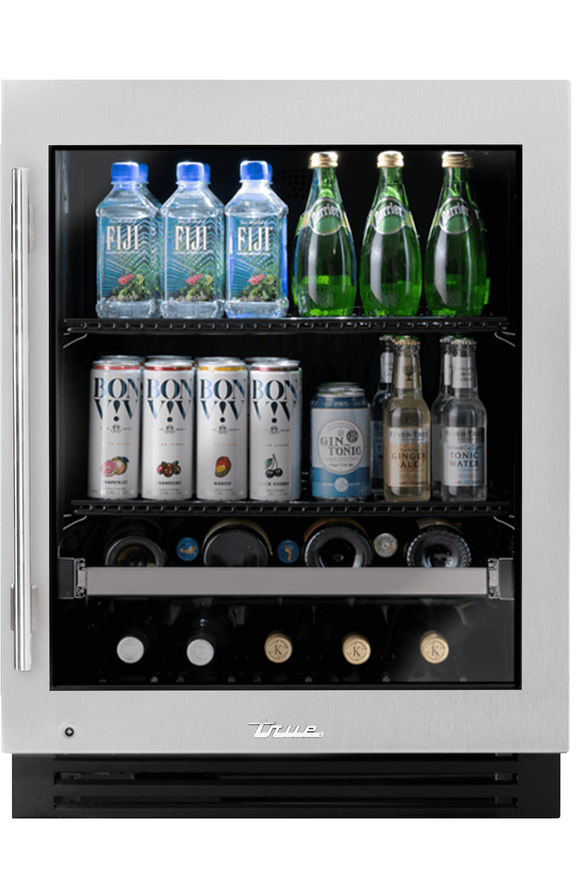
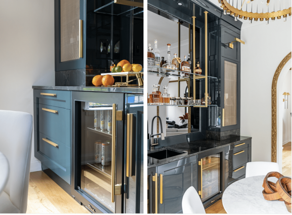
While the rest of the home keeps to the same aesthetic with some differentiating palettes, metals, and finishes, everything connects in a cohesive manner. On the other side of the home, right off the living room, Skilling also renovated an existing bar. “They love to entertain,” she explains and they were thrilled to be able to have that element near a living space. In the bar, cabinetry outfitted in a deep, smoky teal, high-lacquer finish with brass hardware defines the space. The coolest part? Two True Residential units in a matte black finish and gold hardware add a dramatic, yet functional twist. Above them, semi-mounted clear glass-and-brass shelves create another stunning focal point. While the clients adore the bar and plan to make great use of it, they also truly fell in love with the kitchen, explains Skilling. “They love how warm and inviting it is, how well it fits in with the rest of their home. It feels like a seamless transition.” She adds “Whenever we’re designing a house especially with an addition, we want it to feel like it has always been there.” As for the designer’s thoughts on our units? “This is the first time I have used them. It definitely won’t be the last,” says Skilling.
