Photography: Interiors by Young Glass
It’s rare for a designer to get to work on a 10,000-square-foot home from start to finish. It’s even rarer for those clients to be friends. When Enrico DiRisio began working on the interiors of their family residence, located in the Niagara area of Canada, he already had a good grasp on the couple’s taste, so he knew to take cues from the home’s waterfront views and serene landscape.
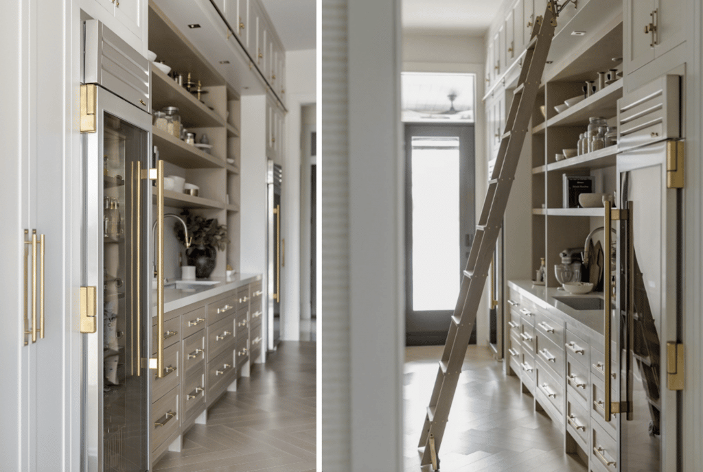
The family, he says, were huge entertainers, with a background in the hospitality industry. It was important to them to have an open concept plan—especially in the kitchen. To create a space that worked for them, he enlisted Thorpe Concepts to build the cabinetry he designed. “They’re very much known for the handmade quality of their cabinetry—there is a lot of time and detail that goes into their work. Their cabinetry has a furniture-like feel, something you would find in a Bespoke Old World style home,” explains DiRisio.
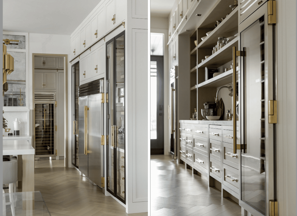
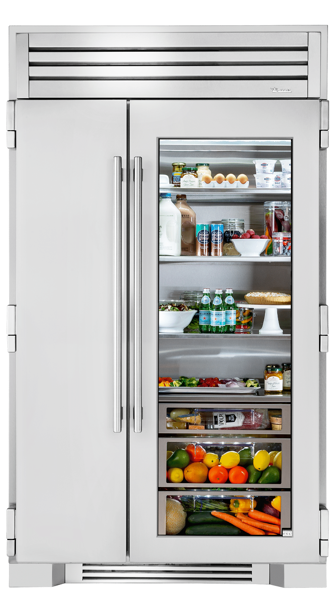
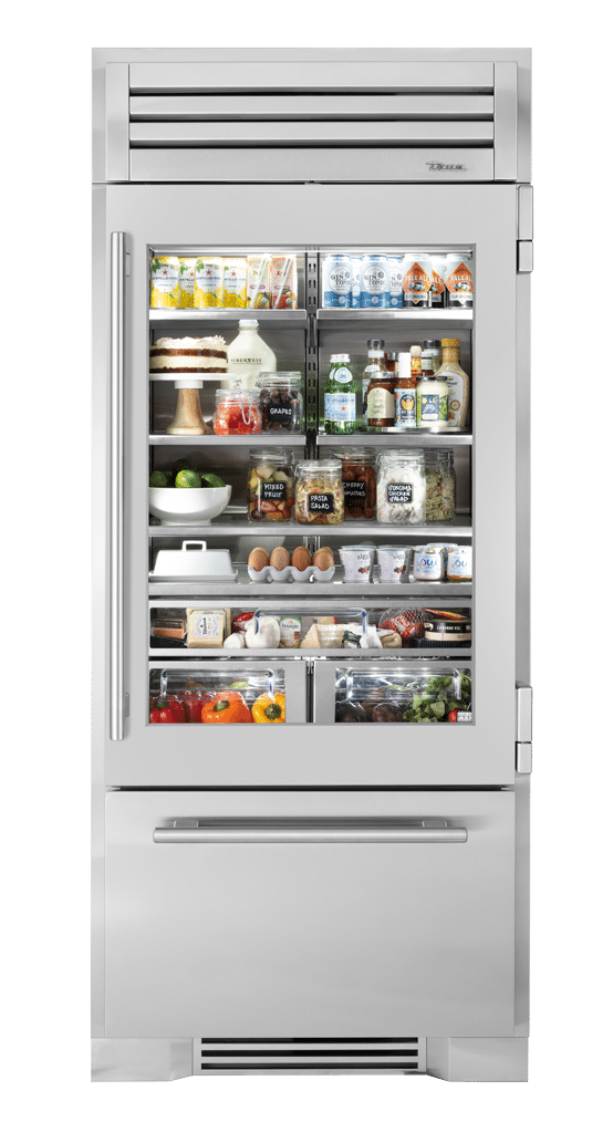
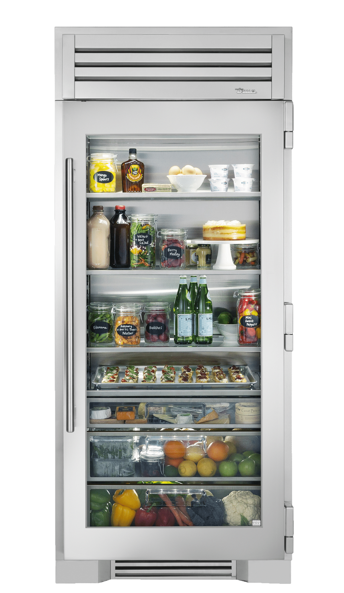
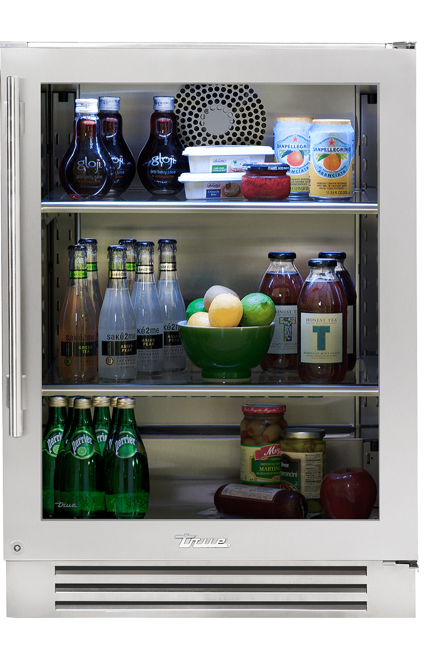
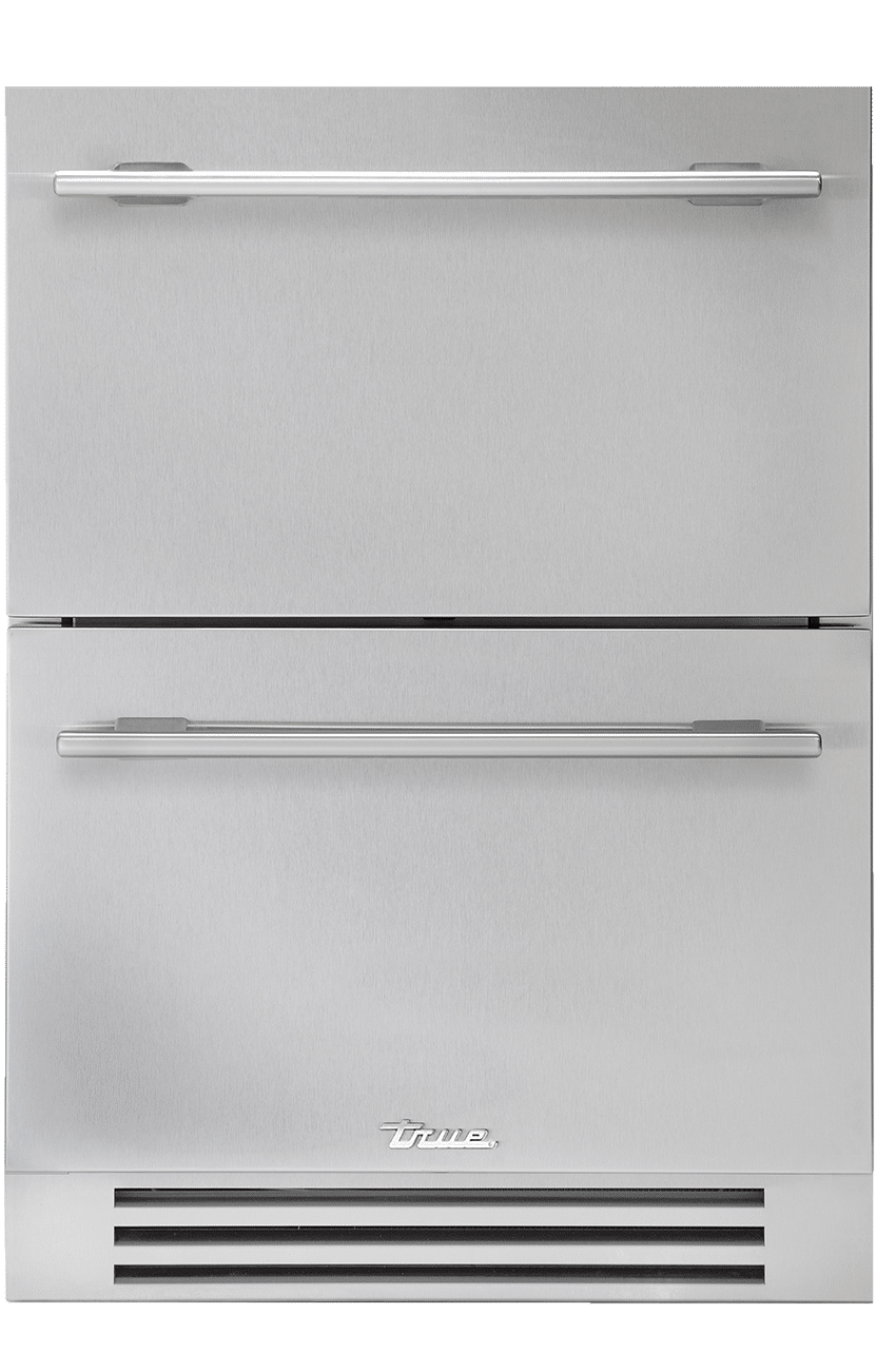
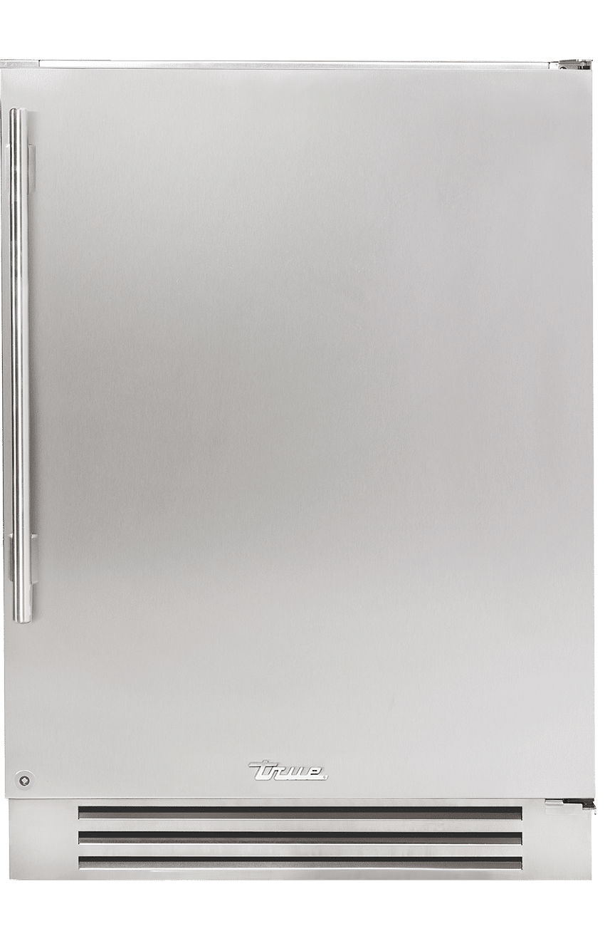
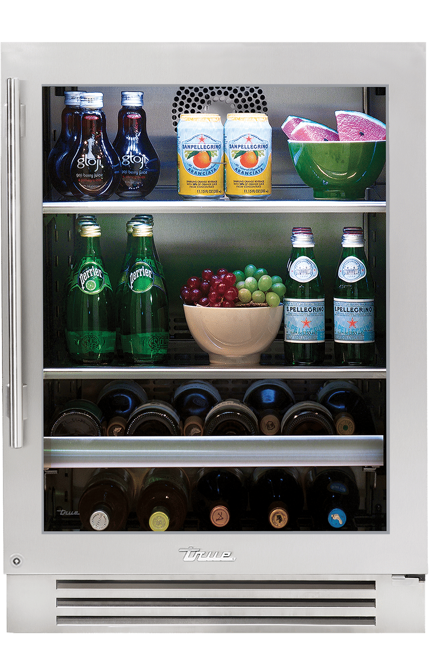
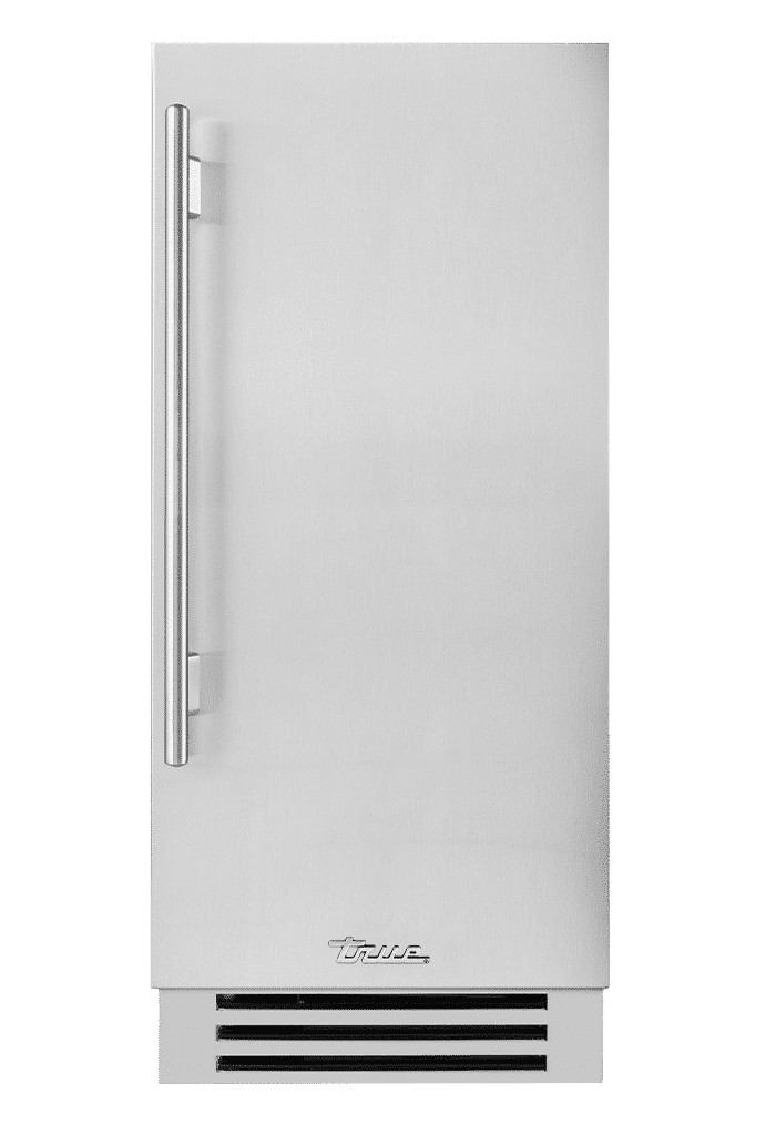
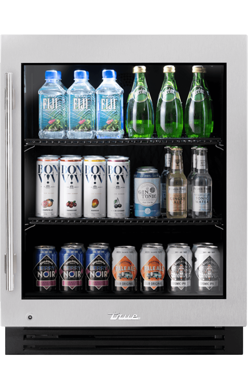
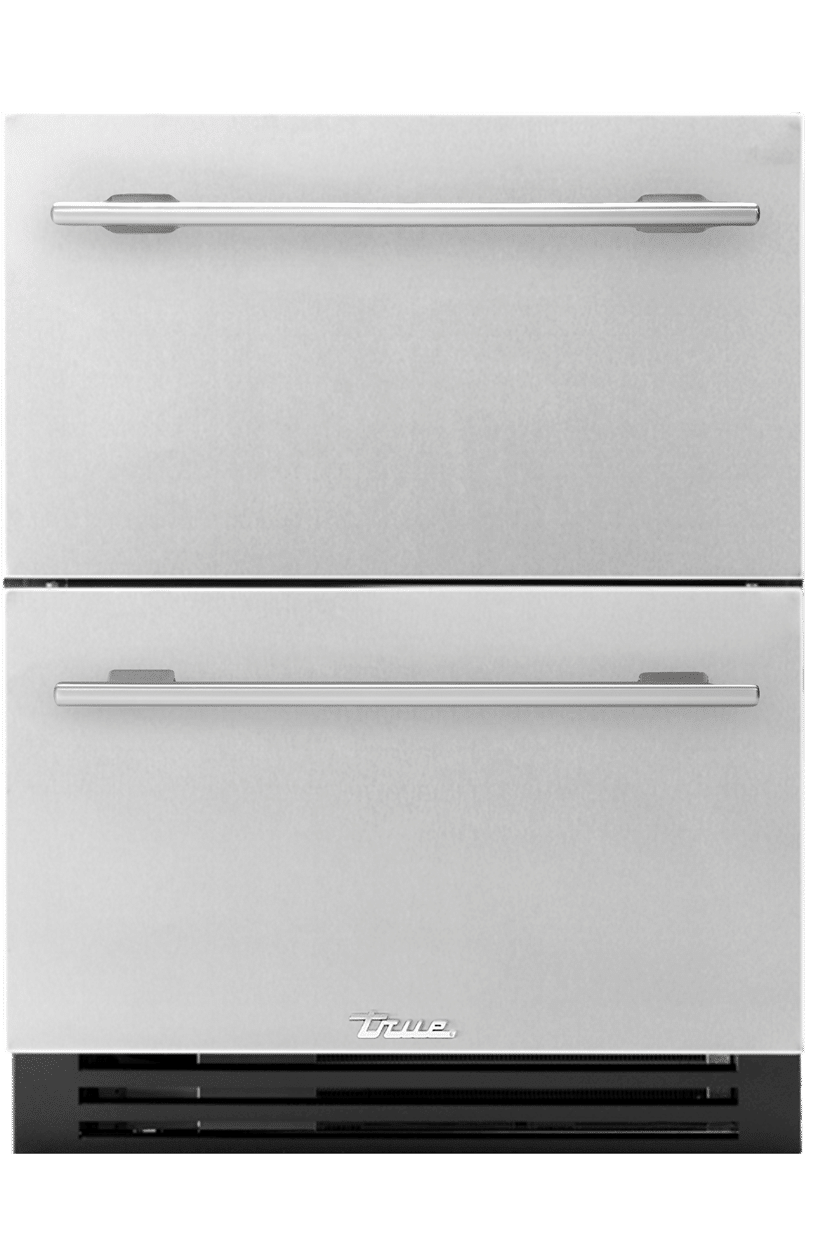
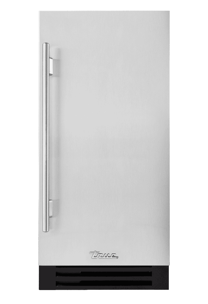
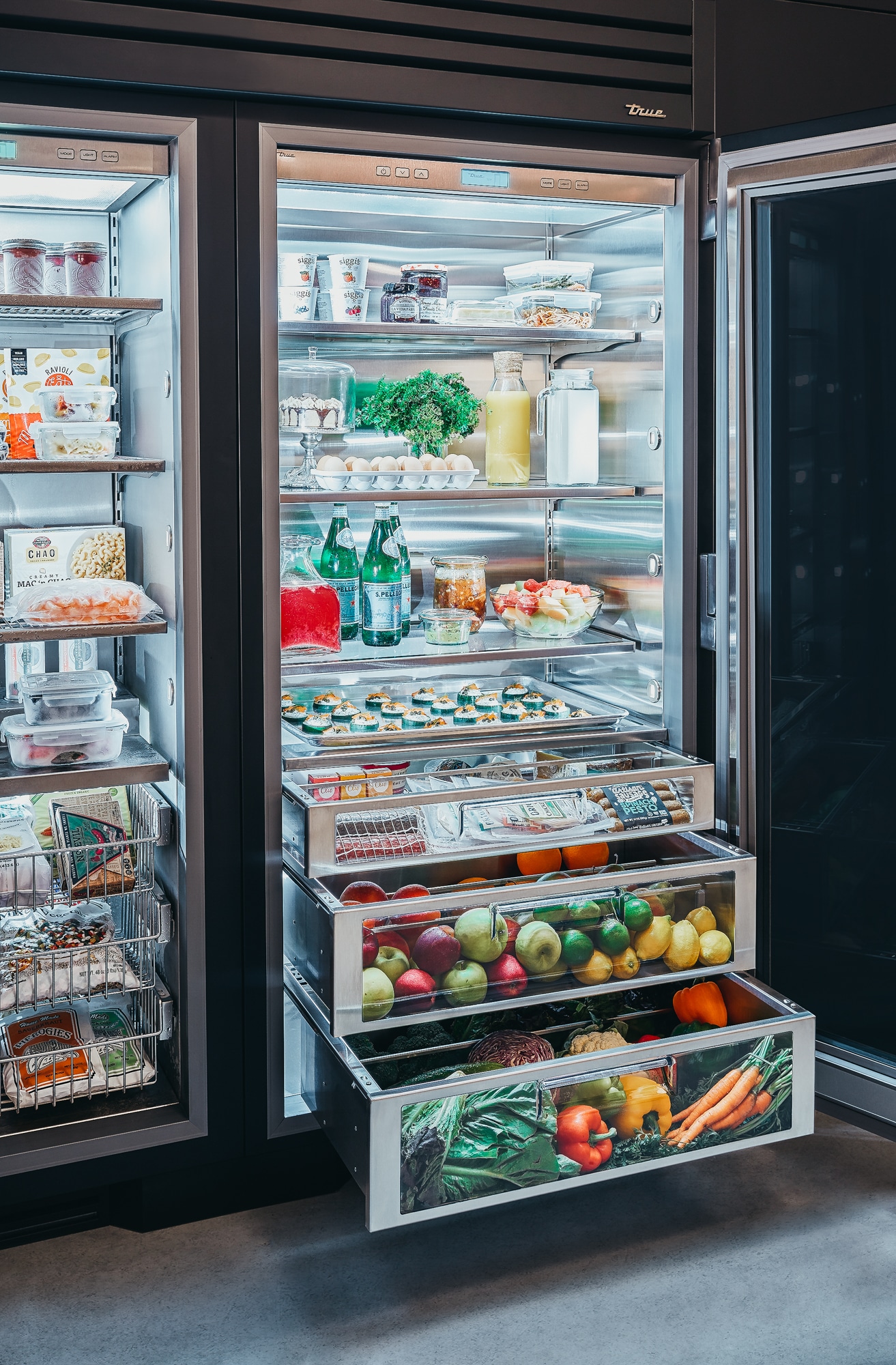
The island became the focal point, flanked by two 30” True Residential refrigeration units in stainless steel and brass framed by glass cabinets to the right and with additional storage to the left. The family’s close ties to the restaurant industry left them very familiar with True products, but when DiRisio introduced them to the residential line, “it was a no-brainer,” he said. “I loved the idea of a refined commercial-looking fridge—they have the elements and quality of True’s heritage commercial-style refrigerators—but they’re streamlined and refined for residential,” he explains. “The unique detail of the exposed hinges and oversized handles is what sets True apart. I love being able to mix and match all the different colors and finishes to blend seamlessly with my designs.” In fact, he chose the contrasting metals to serve as a bit of an added punch to the soft, warm earthy palette they chose for the kitchen. A Farrow & Ball paint with a soft stone look graced the walls while the designer and Thorpe Concepts came up with a custom stain for the wood, interspersed throughout with natural wood.
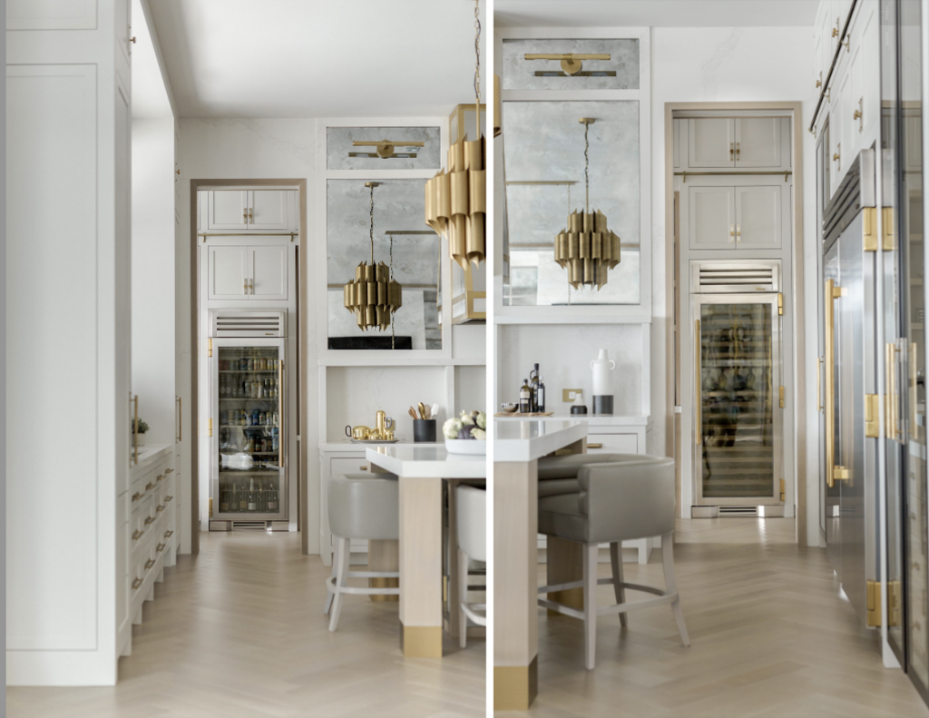
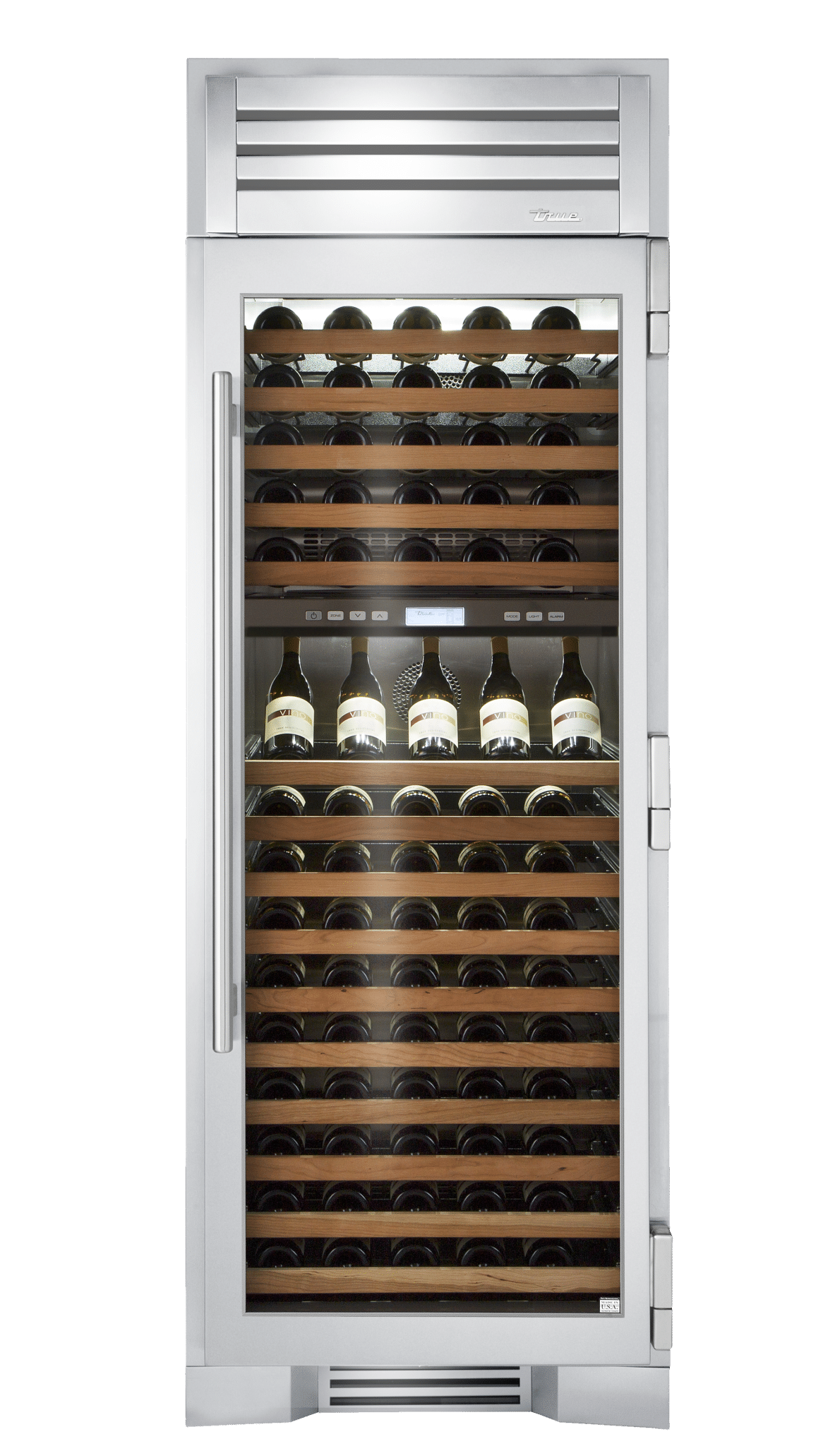
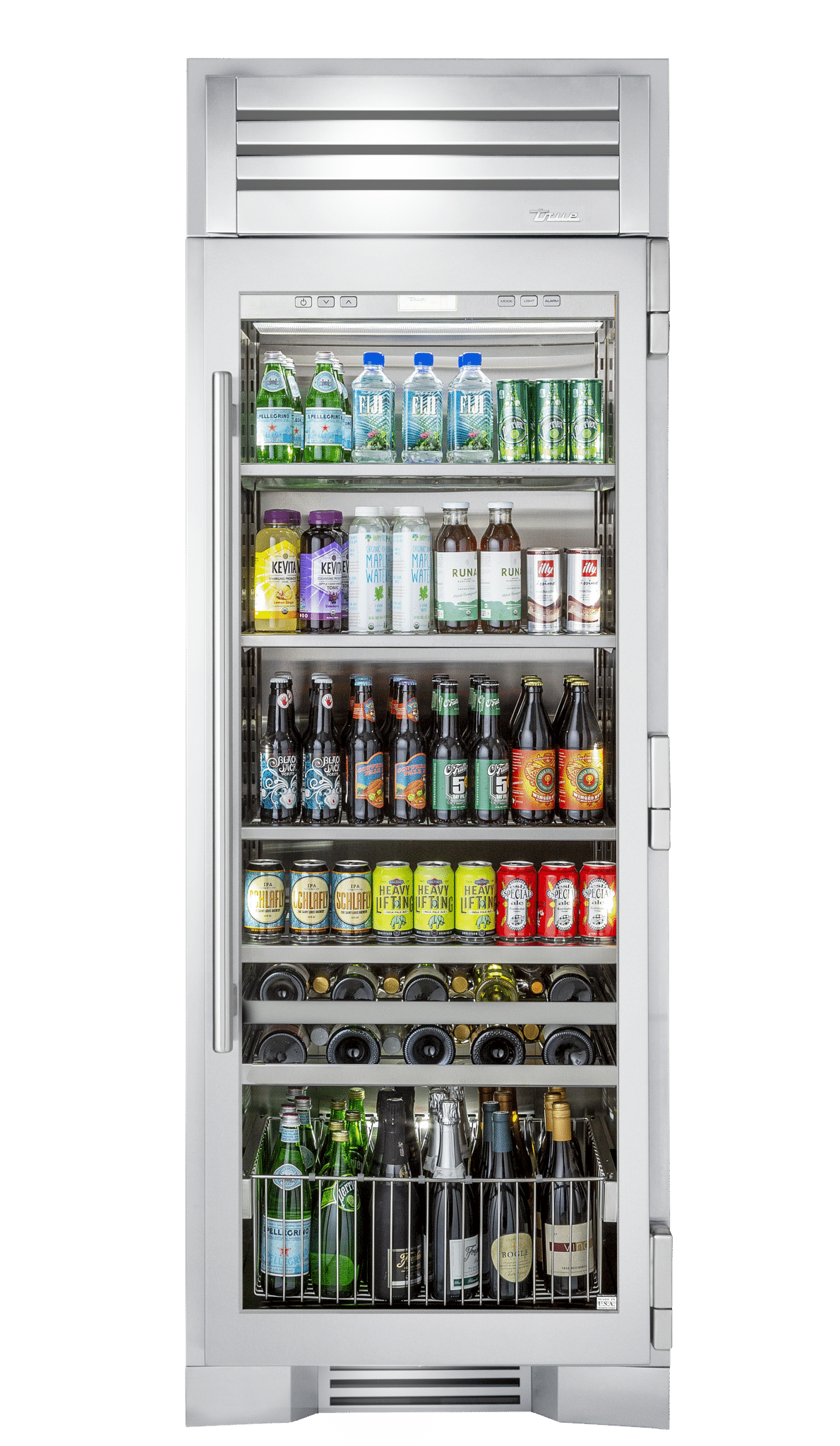
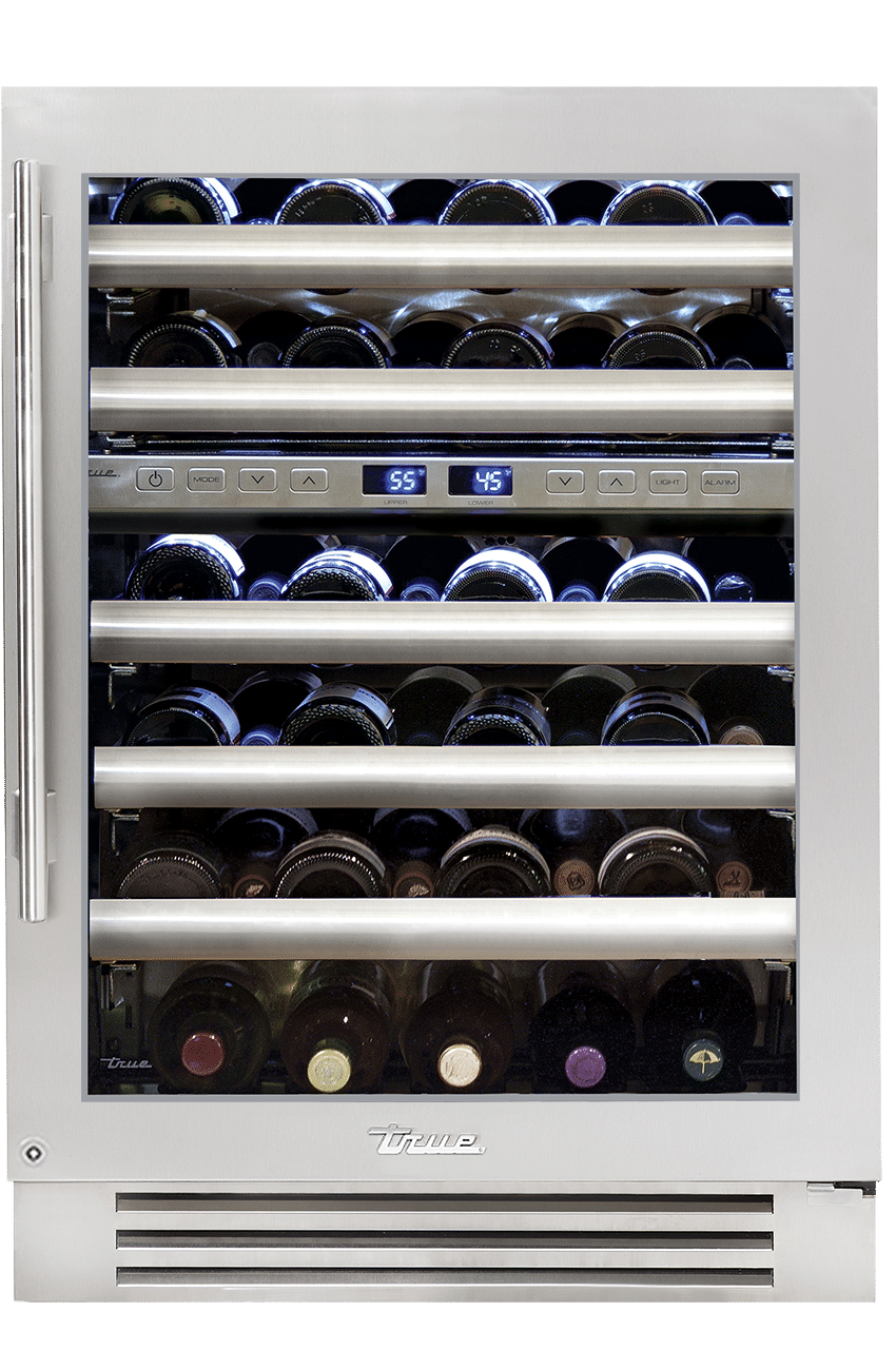
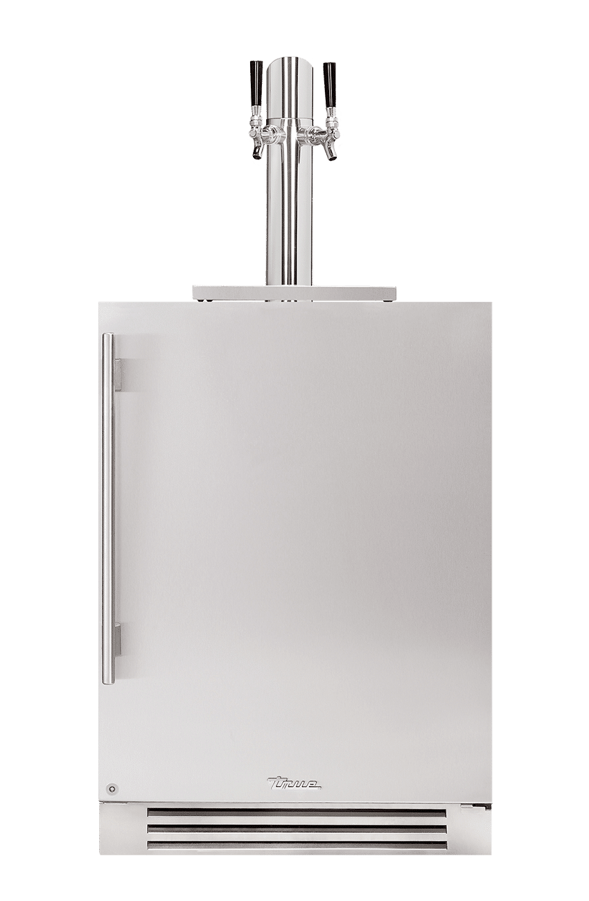
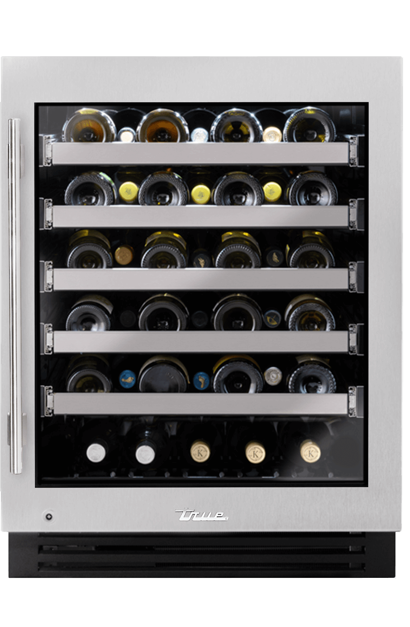
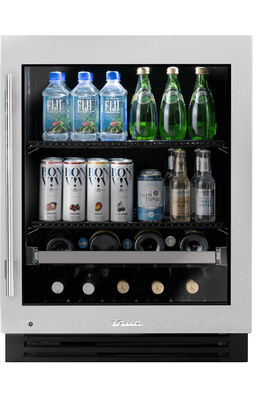
The most alluring aspect? The symmetrical openings on either side of the kitchen’s back wall, which lead to a ‘hidden’ Butler’s Pantry, each feature a True Residential unit as the main focal point. Our Beverage Column was strategically placed on the left side, closest to a door that leads to the outside back patio, perfect for easy access to outdoor entertaining. On the right, our 30” Dual Zone Wine Column takes center stage. It was the perfect way to establish an easy open flow from the main kitchen to the Butler’s Pantry or “prep kitchen” while still keeping to the classic, timeless aesthetic. We’re also prone to agree with DiRisio’s statement: “The True products are truly what makes this kitchen design. I love the products and my clients love them even more!”
